CHART CHAT
How Did We Get Here ?
In this edition of Chart Chat, we will again discuss the Chart Pattern known as Consolidation. As covered in Chapter 2 of our publication When to Buy and When to Sell; Combining Easy Indicators, Charts, and Financial Astrology (available on Amazon), and our Chart Chat – Consolidation blog, dated 9-22-24, we discuss popular chart patterns regularly used by investors and traders alike. The patterns are generally the easiest to identify and determine a target price or move, based on historical data.
An important, often overlooked, factor when attempting to identify a trading/investing opportunity, is the route a specific stock or index took to reach its current point. Whether an equity is forming a consolidation, wedge, head & shoulders, cup & handle, or any other pattern, there is a unique path it has taken prior to the new development. This is commonly referred to as “looking to the left,” to determine the validity of the current price action and/or the probability of its next move. Like snowflakes, no two charts are exactly the same, and the previous movement can be essential in its future action.
By looking to the left one can determine whether a stock is trending or choppy, reaching all-time highs or lows, seasonal, and what its tendencies may be, over several time periods. Support & Resistance levels, as well as various chart patterns, can also be identified the longer the time period the chart displays.
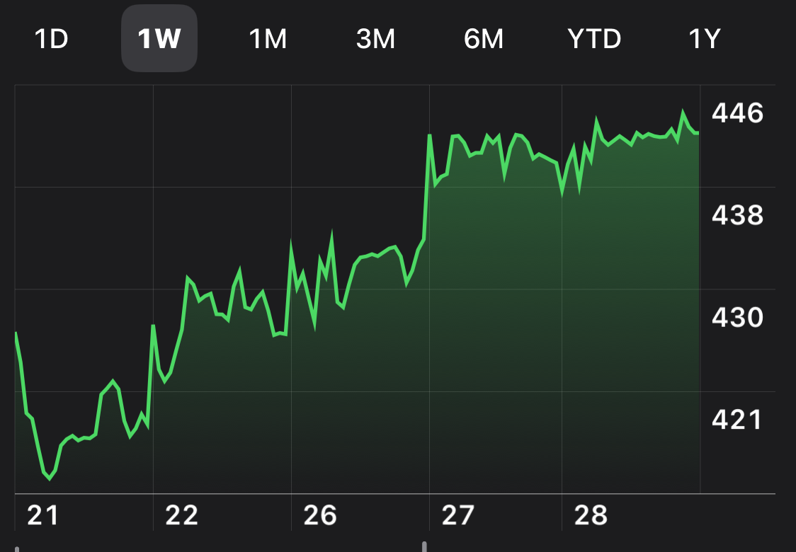
Figure 1
The above chart (Figure 1) displays a perfect example of a consolidation period in a stock that formed during a clear uptrend in price, in a 1-week (5-day) chart. The trade was bullish in direction for three days, until moving sideways for the last two. Notice, however, that price had been trending down just prior to the first day, as indicated by the line to the far left. Any entry of a bullish position from the 21st through the 27th would remain profitable. Although the swing-trader who recognized a reversal would have been profitable during this period, how were they able to identify the change in direction?
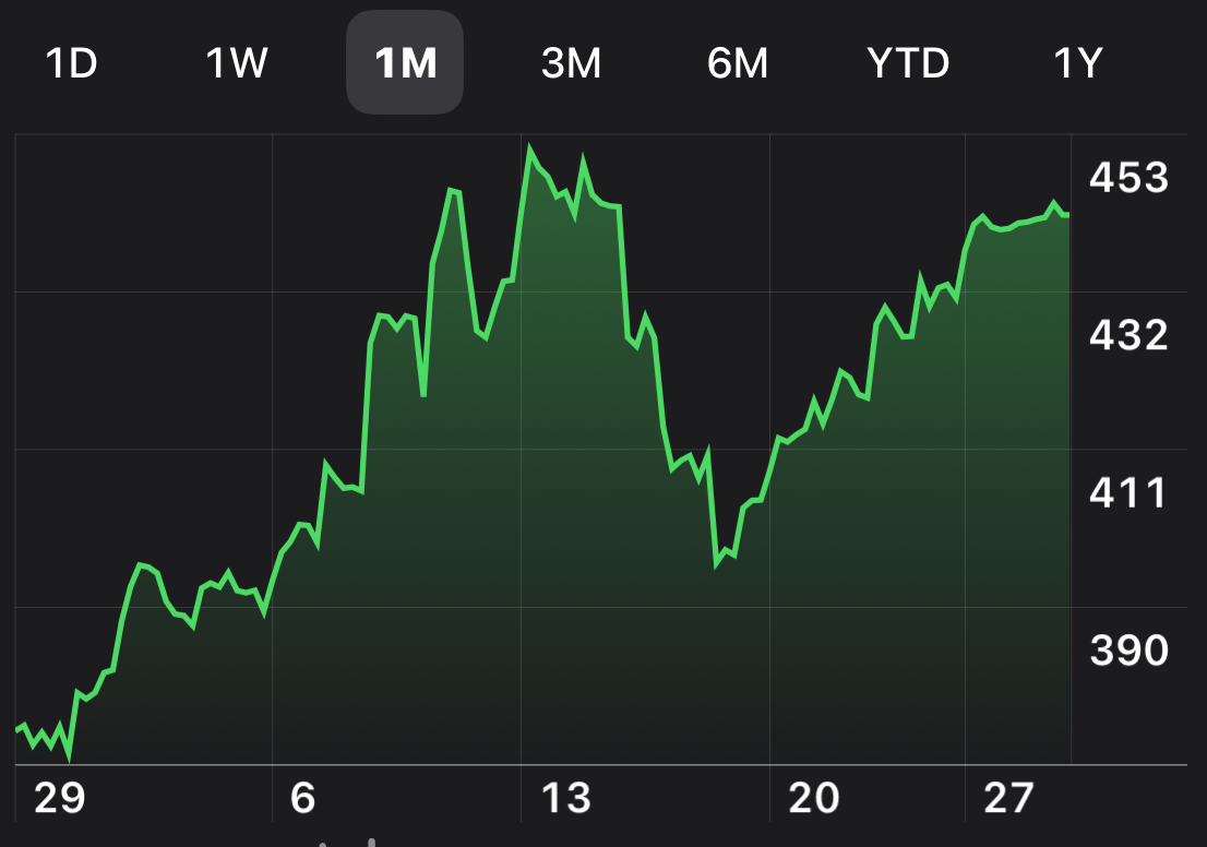
Figure 2
Now take a look at Figure 2 of the same stock chart. This provides a slightly different perception of the price action, as although the 1-month (30 day) chart also indicates an uptrend, the consistency of that trend is not the same. This period did appear to be entered in a consolidation period (far left), and either developed, or continued the previous trend. The pullback in the middle was very close to a 50% retracement (for those who follow Fibonacci levels), and could be considered a large Bull Flag. The investor/trader who entered around the 29th made initial gains, but did not from the 13th to the 27th. The individual who entered around the 20th, after a Bull Flag reversal confirmation, has made profit since the entry.
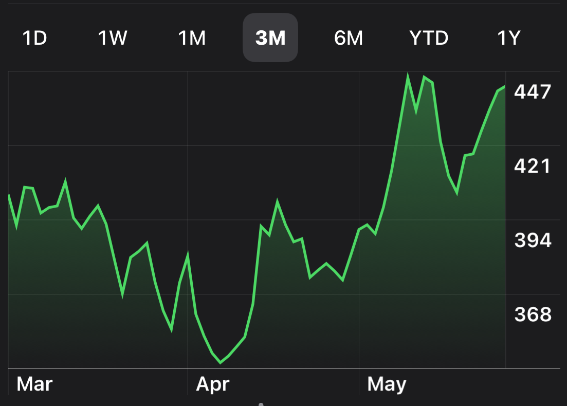
Figure 3
Now take a look at Figure 3 of the same stock chart. This 3-month chart illustrates that the 1-month chart actually began after a Bull Flag move in the stock, not a consolidation. This price action depicts the reversal as actually starting near the beginning of April, with two sizeable pullbacks (Bull Flags), and the preceding trend appeared to be downward, or bearish. The safest entry identified, in this time frame, was about the 1st of May, after price break-out of a longer Resistance line. Still, any opening of a bullish position, other than at the double-top in early May, would be profitable.
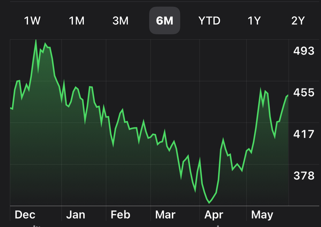
Figure 4
Now take a look at Figure 4 of the same stock chart. This 6-month chart clearly indicates a full 4-month decline in price, prior to the reversal, a whole different perception than the 1-week chart (Figure 1). The best entry into the stock, based on this time period, would have been after a confirmation of reversal at the end of April/beginning of May. Anyone who decided to open a bullish position in December is hugely unprofitable, to date, even after the strong reversal, as price has not yet returned to the cycle high level. The initial surge at the beginning of April would likely have been ignored by most experienced investors/traders, as they waited for confirmation of the uptrend reversal. Remember that the longer the trend, the more likely it is to continued after a consolidation or pullback.
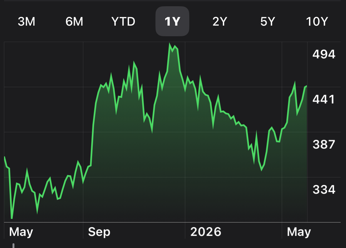
Figure 5
Now take a look at Figure 5 of the same stock chart. This 1-year chart again changes the perception of the stock, at least to a longer-term investor/trader. For those who opened positions in the prior summer, they remain in positive territory, especially after the recent surge. For those a little late to the game in the fall, they are fortunate to be back to about break-even. The best entry in this time frame was clearly immediately after the break-out in early September. Those who entered in mid-to-late September were likely stopped-out at some point and experienced a losing trade. Many inexperienced individuals would likely have ignored this stock altogether, based on their knowledge and research regarding the company.
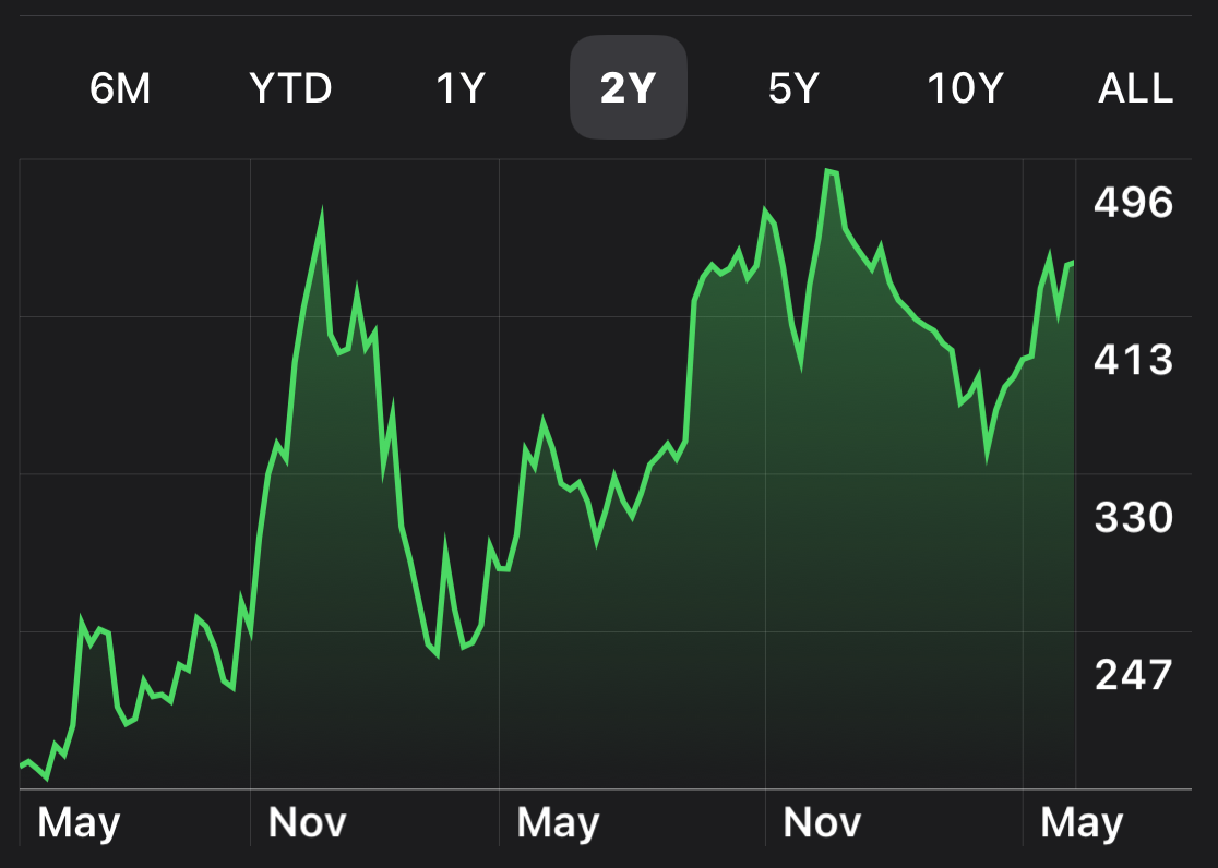
Figure 6
Now take a look at Figure 6 of the same stock chart. This 2-year chart, despite showing a longer-term uptrend, clearly illustrates how volatile it really is. Those investors who believed in the stock, purchased in May 2 years prior, and ignored the choppiness, are highly profitable. Traders of this stock needed to be very careful, as it is likely heavily effected by news and earnings reports (as highly volatile stocks usually are), and is also likely to have a large daily Average True Range (large range of price throughout a session). At the very least, it displays that the stock is generally a much safer buy after large pullbacks.
Hopefully this exercise has proven the importance of expanding the time periods when considering a position, long or short, on an equity. The “story” it tells through time can be very telling, and can certainly persuade the decision of when, and if, to open a position. Always remember to “Look to the Left” to provide this important information. In case you hadn’t figured it out - this is the current chart for Tesla.
Astrologically speaking, planet positioning and transits through the zodiac houses, and signs, has many similarities to technical analysis. The theme of cycles, repeating patterns, and historical data can be viewed the same way, as the probabilities can be calculated from previous percentages of success. The difference is the use of an Ephemeris, a basic calendar of future planetary transits and aspects (see Chapter 4 of our publication for details), which allows for future positions to be known, unlike the next line, bar, or candle on a technical chart. Although no source will be 100% accurate, this extra layer can be very useful. For those interested, please refer to Trader Transits and U.S. Stock Market blogs on this site, as well as the last section of each weekly Fear & Greed Index update.
***As always, this information is not intended to be financial advice, or any specific buy or sell recommendation, but rather a guide to assist the reader in some further understanding of current economic conditions, chart analysis, or movements in the sky, and how they can affect moods, behaviors, world events, and financial markets.